
Introduction: Turning Raw Production Data into Insights
In the solar manufacturing industry, every watt of power counts—and so does every percentage of efficiency. With demand for clean energy on the rise, production teams must continuously monitor and optimize their processes. That’s where Power BI steps in.
In this post, we explore a real-world dashboard built for a Solar Panel Production System. Using Power BI, we combine data from multiple dimensions—date, operator, panel type, and assembly line—to create interactive visuals that help factory managers and engineers make smart, data-driven decisions.
Why Monitor Solar Panel Production Data?
Tracking efficiency metrics isn’t just about quality assurance—it’s about cost-saving, performance optimization, and predictive maintenance. Here’s why it’s crucial:
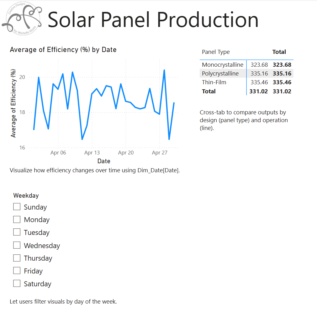
- Efficiency (%) Trends Over Time
Monitoring efficiency changes daily (as shown in our line chart) can reveal anomalies in assembly performance or material defects. This allows teams to investigate drops and pinpoint causes. - Panel Type vs Output Comparison
The matrix view enables comparison between panel types like Monocrystalline, Polycrystalline, and Thin-Film. Understanding which design delivers the highest power output under similar conditions guides procurement and R&D. - Weekday Performance Filtering
By introducing a slicer onDim_Date[Weekday], the dashboard answers questions like:
“Are Mondays less efficient than Thursdays?”
Managers can then align shifts, maintenance schedules, or training based on weekday trends.
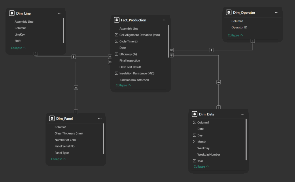
What’s Behind the Dashboard?
Here’s a breakdown of the key datasets driving the report:
- Dim_Date.csv – Supplies calendar fields like Date, Weekday, and Month for time-based analysis.
- Dim_Line.csv – Contains metadata for each production line.
- Dim_Operator.csv – Lists operator information to later correlate with efficiency.
- Dim_Panel.csv – Describes panel types, thickness, and serial numbers.
- Fact_Production.csv – The heart of the model, it records daily panel outputs, cycle times, and efficiency metrics.
All tables are modeled in Power BI using star schema design principles, with Fact_Production at the center and dimensions connected via surrogate keys like LineKey, PanelKey, and Date.
The Power of the Visuals
| Visual | Purpose |
|---|---|
| Line Chart | Tracks Average Efficiency (%) over time |
| Matrix Table | Compares Power Output (W) across panel types |
| Slicer (Weekday) | Allows filtering by day of the week to detect shift-related patterns |
| Cross-Highlighting Enabled | Ensures all visuals interact dynamically, offering contextual insights |
How It Helps the Production Company
- Faster Root Cause Analysis: When efficiency dips, the dashboard quickly shows if it’s tied to a specific day, line, or panel type.
- Performance Benchmarking: Compare operators and shift outputs to reward top performers or target retraining.
- Product Development Feedback: Insights from panel type performance drive innovation in panel design and material selection.
- Decision Support: With historical trends, managers can make informed decisions on staffing, procurement, and machine maintenance.
Final Thoughts
This Power BI solution showcases how modern data tools can transform raw production data into actionable insights. Whether you’re managing a solar factory or any assembly-based operation, dashboards like this one help align production goals with real-world performance.
Want to explore this system further or use it in your own manufacturing setting? Get in touch, or explore the datasets and report structure on GitHub.
Let’s Connect!
🎥 YouTube
👩💻 GitHub
💼 LinkedIn
📱 Instagram
📘 Facebook
Thanks so much for dropping by.