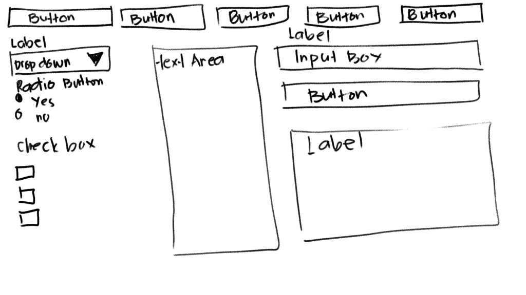
Ever sketched a UI layout on paper and wondered how to bring it to life with code?
In this tutorial, we’ll walk through the process of transforming a simple hand-drawn UI sketch into a fully structured GUI layout using PySide6, the official Python bindings for the Qt toolkit. Whether you’re prototyping your next app, learning layout management, or just getting started with Python desktop development, this post will help you visualize and implement your design step by step—no backend logic required.
We’ll focus purely on the visual structure of the GUI—arranging buttons, labels, input fields, and text areas to match your original sketch. By the end, you’ll have a clean layout built with QVBoxLayout and QHBoxLayout, and a deeper understanding of how PySide6 handles widget positioning.
If you’re a visual thinker or UI designer entering the world of Python development, this layout-first approach is a great place to begin.
Layout Strategy
Before jumping into the code, let’s take a moment to analyze the sketch and plan out how to structure it using PySide6’s layout system.
Qt (and PySide6 by extension) uses layout managers like QVBoxLayout and QHBoxLayout to arrange widgets in vertical and horizontal flows. By nesting these layouts, you can build complex and responsive UIs—just like stacking building blocks.
Visual Breakdown of the Sketch
My hand-drawn UI sketch can be divided into two main parts:
- Top Bar (Navigation Buttons)
A horizontal row of 5 buttons aligned side by side — best handled by aQHBoxLayout. - Main Content Area
A three-column structure arranged horizontally:- Left Panel: Label, dropdown (
QComboBox), radio buttons, checkboxes - Center Panel: Large text area (
QTextEdit) - Right Panel: Label, input field (
QLineEdit), button, output label
- Left Panel: Label, dropdown (
This calls for a main vertical layout (QVBoxLayout) containing:
- The top button row
- The content row with three vertical sub-panels
Layout Plan
Here’s how we’ll nest the layouts:
QVBoxLayout (Main Layout)
│
├── QHBoxLayout (Top Button Row)
│   ├── QPushButton("Button 1")
│   ├── QPushButton("Button 2")
│   ├── ...
│
└── QHBoxLayout (Main Content Row)
    ├── QVBoxLayout (Left Panel)
    │   ├── QLabel
    │   ├── QComboBox
    │   ├── QRadioButtons
    │   ├── QCheckBoxes
    │
    ├── QVBoxLayout (Center Panel)
    │   └── QTextEdit
    │
    └── QVBoxLayout (Right Panel)
        ├── QLabel
        ├── QLineEdit
        ├── QPushButton
        └── QLabel
Why This Structure Works
- Separation of concerns: Each section of the UI is isolated in its own layout.
- Scalability: You can easily add or remove widgets within a section without affecting others.
- Alignment control: You gain precise control over spacing, padding, and alignment using layout methods.
The PySide6 Code
from PySide6.QtWidgets import (
    QApplication, QWidget, QPushButton, QLabel, QComboBox,
    QRadioButton, QCheckBox, QTextEdit, QLineEdit,
    QVBoxLayout, QHBoxLayout, QButtonGroup
)
from PySide6.QtCore import Qt


class CustomWindow(QWidget):
    def __init__(self):
        super().__init__()
        self.setWindowTitle("Custom GUI Layout")
        self.resize(900, 600)

        main_layout = QVBoxLayout()
        content_layout = QHBoxLayout()

        # Top Button Bar
        top_button_layout = QHBoxLayout()
        for i in range(5):
            btn = QPushButton(f"Button {i+1}")
            btn.setFixedHeight(40)
            top_button_layout.addWidget(btn)
        main_layout.addLayout(top_button_layout)

        # Left Panel
        left_panel = QVBoxLayout()
        left_panel.addWidget(QLabel("Label"))

        combo = QComboBox()
        combo.addItems(["Option 1", "Option 2", "Option 3"])
        left_panel.addWidget(combo)

        left_panel.addWidget(QLabel("Radio Button"))
        radio_group = QButtonGroup(self)
        radio_yes = QRadioButton("Yes")
        radio_no = QRadioButton("No")
        radio_group.addButton(radio_yes)
        radio_group.addButton(radio_no)
        left_panel.addWidget(radio_yes)
        left_panel.addWidget(radio_no)

        left_panel.addWidget(QLabel("Check Box"))
        for _ in range(3):
            cb = QCheckBox()
            left_panel.addWidget(cb)

        # Center Panel
        center_panel = QVBoxLayout()
        text_area = QTextEdit()
        center_panel.addWidget(text_area)

        # Right Panel
        right_panel = QVBoxLayout()
        right_panel.addWidget(QLabel("Label"))

        input_box = QLineEdit()
        right_panel.addWidget(input_box)

        right_button = QPushButton("Button")
        right_panel.addWidget(right_button)

        right_panel.addWidget(QLabel("Label"))

        # Assemble Panels
        content_layout.addLayout(left_panel)
        content_layout.addLayout(center_panel, stretch=2)
        content_layout.addLayout(right_panel)

        main_layout.addLayout(content_layout)
        self.setLayout(main_layout)


def main():
    app = QApplication([])
    window = CustomWindow()
    window.show()
    app.exec()


if __name__ == "__main__":
    main()
PySide6 Widgets & Layouts Explained
QApplication
Purpose: The backbone of any PySide6 GUI app. It manages the GUI application’s control flow and main settings.
- You must create one instance per app.
- It handles the event loop, user input, and window updates.
app = QApplication([])
app.exec()         # Starts the event loop
QWidget
Purpose: The base class for all UI elements.
- Every button, label, and even the main window inherits from
QWidget. - You can use it as a standalone window or as a container for other widgets.
class MyApp(QWidget): # Main windowCommon Methods:
show()– Displays the widgetresize(width, height)– Sets initial sizesetWindowTitle("Title")– Sets the window titlesetLayout(layout)– Assigns a layout to the widget
QPushButton
Purpose: A clickable button.
- Used to trigger actions when clicked.
- You can connect it to a function with
.clicked.connect(...).
button = QPushButton("Click Me")
button.clicked.connect(my_function)
Common Methods:
setText("Click Me")– Set the button textclicked.connect(func)– Connects button click to a functionsetEnabled(True/False)– Enable/disable the buttonsetFixedSize(w, h)– Sets exact sizesetStyleSheet("...")– CSS styling
QLabel
Purpose: Displays text or an image.
- Great for showing instructions, output messages, or titles.
- Use
.setText("...")to change its content.
label = QLabel("Hello")
label.setAlignment(Qt.AlignCenter)
Common Methods:
setText("Hello")– Set label contenttext()– Get current textsetAlignment(Qt.AlignCenter)– Center-align textsetPixmap(pixmap)– Show an image
QComboBox
Purpose: A drop-down list of selectable options.
- Users can pick one item from a list.
- Items can be added with
.addItem()or.addItems().
combo = QComboBox()
combo.addItems(["Option 1", "Option 2"])
Common Methods:
addItem("Option")– Add one optionaddItems(["A", "B"])– Add multiple optionscurrentText()– Get selected item textsetCurrentIndex(index)– Set selected indexclear()– Remove all items
QRadioButton
Purpose: A button that belongs to a group, where only one can be selected at a time.
- Use it with
QButtonGroupto manage mutual exclusivity. - Good for “Yes / No”, “Male / Female”, etc.
radio = QRadioButton("Yes")Common Methods:
setChecked(True)– Set selectedisChecked()– Check if selectedtoggled.connect(func)– Run function on togglesetText("Yes")– Set label text
QCheckBox
Purpose: A box the user can check or uncheck.
- Multiple checkboxes can be selected at the same time.
- Use
.isChecked()to check the state.
checkbox = QCheckBox("Subscribe")Common Methods:
setChecked(True/False)– Set stateisChecked()– Get check statestateChanged.connect(func)– Detect changetext()– Get label text
QTextEdit
Purpose: A multi-line text input/output area (like a rich text editor).
- Supports typing, pasting, and formatting.
- Use
.toPlainText()to read the text.
text_area = QTextEdit()Common Methods:
setPlainText("text")– Set contentstoPlainText()– Get contentsclear()– Clear textsetReadOnly(True)– Disable editingappend("...")– Add line to bottom
QLineEdit
Purpose: A single-line text input box.
- Use it for names, emails, search bars, etc.
- Use
.text()to retrieve input.
input_box = QLineEdit()Common Methods:
setText("name")– Set input valuetext()– Get input valueclear()– Erase contentsetPlaceholderText("Enter name")– Set hint texteditingFinished.connect(func)– Trigger on Enter or focus out
QVBoxLayout
Purpose: A layout manager that arranges widgets vertically (top to bottom).
- Automatically stacks widgets in a column.
- Use
.addWidget()to insert widgets.
layout = QVBoxLayout()
layout.addWidget(label)
layout.addWidget(button)
Common Methods:
addWidget(widget)– Add widget verticallyaddLayout(layout)– Nest another layoutsetSpacing(px)– Space between widgetssetContentsMargins(l, t, r, b)– Padding around edges
QHBoxLayout
Purpose: A layout manager that arranges widgets horizontally (left to right).
- Used to create rows of widgets.
- Can be nested inside
QVBoxLayout.
row = QHBoxLayout()
row.addWidget(button1)
row.addWidget(button2)
Common Methods: Same as QVBoxLayout, but arranges left to right.
QButtonGroup
Purpose: Groups multiple
QRadioButtons (orQCheckBoxes) so only one can be selected.
- Useful for managing radio buttons.
- Doesn’t control layout—only logic.
group = QButtonGroup()
group.addButton(radio_yes)
group.addButton(radio_no)
Common Methods:
addButton(button)– Add a radio or checkbox to the groupcheckedButton()– Get currently selected buttonsetExclusive(True)– Only one button active at a timebuttonClicked.connect(func)– React when any button is clicked
BONUS: Common Signals
| Widget | Signal | Triggered When… |
|---|---|---|
QPushButton | clicked.connect() | Button is clicked |
QRadioButton | toggled.connect() | Radio is selected/deselected |
QCheckBox | stateChanged.connect() | Check state is changed |
QLineEdit | editingFinished.connect() | Input loses focus or Enter is pressed |
QComboBox | currentIndexChanged.connect() | Selected item changes |
Summary Chart
| Widget | Purpose |
|---|---|
QApplication | Starts & manages the app |
QWidget | Base class for all UI elements |
QPushButton | Clickable button |
QLabel | Display text or images |
QComboBox | Drop-down menu |
QRadioButton | Select one option in a group |
QCheckBox | On/off toggle box |
QTextEdit | Multi-line text input |
QLineEdit | Single-line text input |
QVBoxLayout | Vertical layout manager |
QHBoxLayout | Horizontal layout manager |
QButtonGroup | Logical group for radio buttons |
What Is Qt Used For?
from PySide6.QtCore import QtThis line imports the Qt namespace from the PySide6.QtCore module. It’s a core part of PySide6 used to access constants, enums, and flags related to alignment, keyboard modifiers, mouse buttons, window states, etc.
Qt is a container for a wide variety of enumeration values that you’ll use to control things like:
1. Text Alignment
Used with QLabel, QTextEdit, QLineEdit, etc.
label.setAlignment(Qt.AlignCenter)              # Center (horizontal and vertical)
label.setAlignment(Qt.AlignLeft | Qt.AlignTop)  # Top-left
2. Keyboard Modifiers
Used when detecting keys like Ctrl, Shift, etc.
def keyPressEvent(self, event):
    if event.modifiers() == Qt.ControlModifier:
        print("Ctrl key pressed")
3. Window Flags and States
Control how the window behaves or appears.
self.setWindowFlag(Qt.FramelessWindowHint)   # Removes title bar
self.setWindowState(Qt.WindowMaximized)      # Start in maximized mode
4. Mouse Buttons
Used in mouse event handlers.
def mousePressEvent(self, event):
    if event.button() == Qt.LeftButton:
        print("Left click")
Common Qt Alignment Constants
| Constant | Meaning |
|---|---|
Qt.AlignLeft | Align left |
Qt.AlignRight | Align right |
Qt.AlignTop | Align to the top |
Qt.AlignBottom | Align to the bottom |
Qt.AlignHCenter | Align horizontally center |
Qt.AlignVCenter | Align vertically center |
Qt.AlignCenter | Both horizontal and vertical center |
What the App GUI looks like
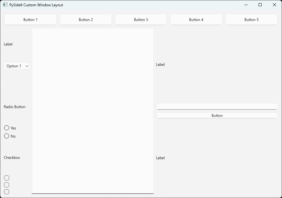
Conclusion
Designing a GUI doesn’t have to start with code—it can start with a simple sketch, a clear idea, and a solid layout strategy. In this post, we took a hand-drawn UI concept and translated it into a well-structured layout using PySide6, focusing purely on visual organization without diving into functionality.
By leveraging layout managers like QVBoxLayout and QHBoxLayout, you now have the foundation to build scalable, clean, and visually organized desktop applications. Whether you’re just getting started or planning to add interactivity later, this layout-first approach ensures your GUI is thoughtfully designed from the start.